The Presence Worship Project
As part of a school project, I was challenged to find a local group that might need some help with graphic design. I got connected to Presence Worship, an organization based out of Wichita, Kansas that is committed to helping young people learn to lead God’s people in worship.
I was super excited about this idea, especially because I feel that I have a pretty good understanding of the type of design Gen Z might find themselves attracted to, being a member of Gen Z myself.
With this in mind, I set to work on creating a revamped version of the logo, making a style guide, producing posters, and designing merchandise and social media templates. Although very little of this is in production today with Presence, I am still incredibly proud of what I put together for this inspiring crew.

Logo Redesign
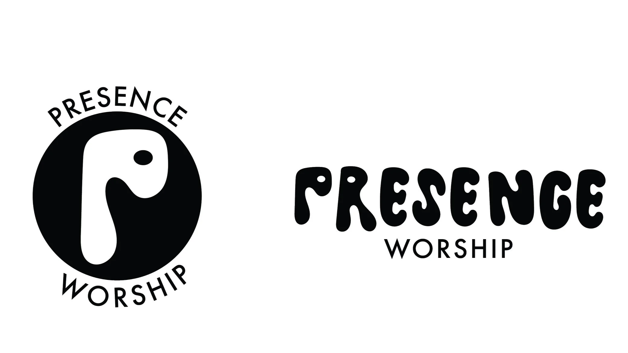
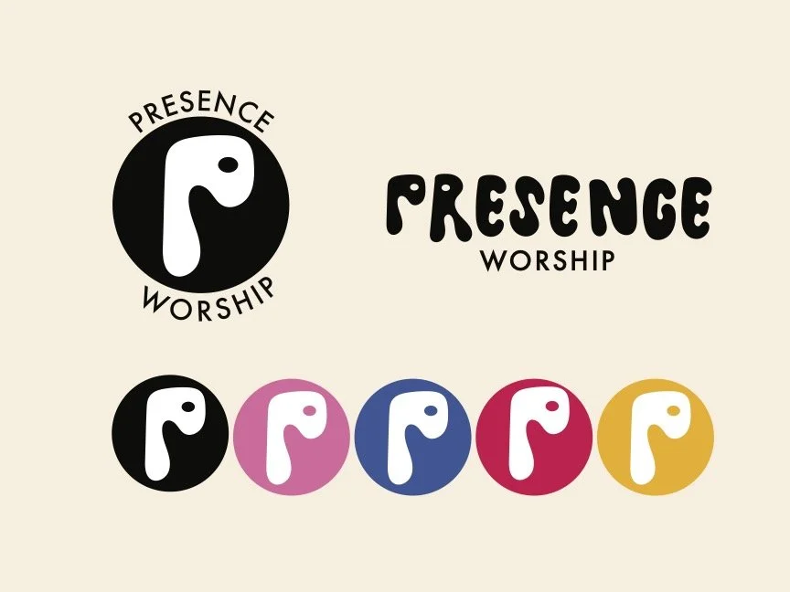
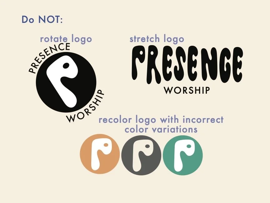
Although the Presence team wanted to keep the overall concept of their logo the same, I thought their logo could use a little extra sprucing up for gen Z students. The “P” felt fairly stale to me, and I felt they could use something new and more energetic.
I started sketching some ideas, sticking with the simple “P” concept, and ended up finding a new solution that I thought was fairly clever and fun!
Although the Presence team wanted to keep the overall concept of their logo the same, I thought their logo could use a little extra sprucing up for gen Z students. The “P” felt fairly stale to me, and I felt they could use something new and more energetic.
I started sketching some ideas, sticking with the simple “P” concept, and ended up finding a new solution that I thought was fairly clever and fun! This new logo also has a double meaning, as the reality of worship has shifted with the changing of times. Not only is it a “p,” but this logo also resembles an airpod. While corporate worship is incredibly important, I also think recognizing that Gen Z students often connect with the Lord through music on their own is also important. Worship is everywhere, and there are many ways to worship our savior aside from leading on stage.
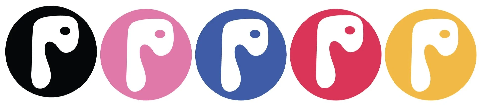
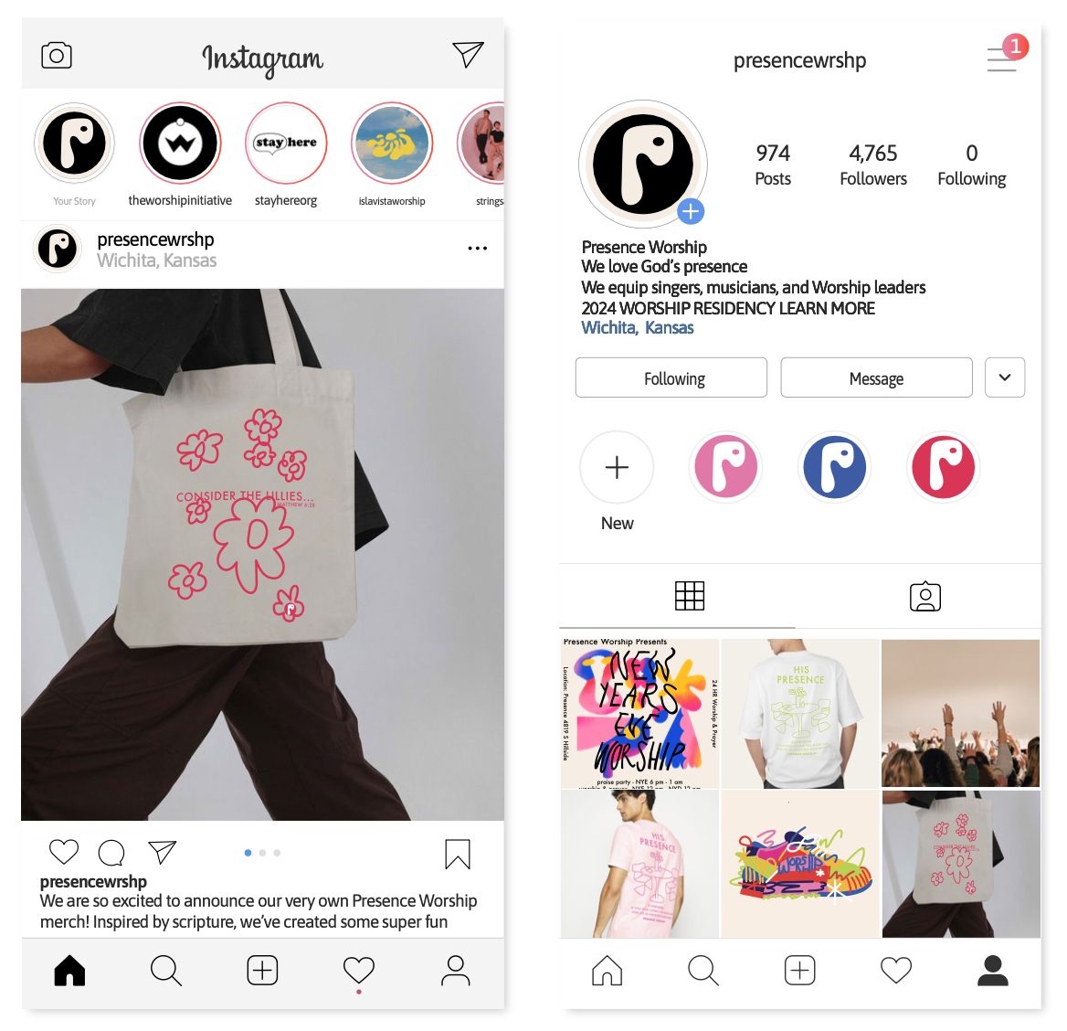
In addition to a new logo, I worked to create a style guide that feels cohesive with Presence Worship’s mission and target audience. As an organization, Presence has a desire to equip next generation worship leaders, specifically looking towards Gen Z to lead. In order to be effective, I believe it is important to have design that feels up-and-coming — design that is appealing to Gen Z.
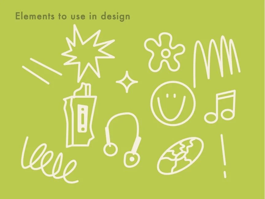
With this in mind, I created a color scheme that feels cohesive, young, energetic, and fun. As a member of Gen Z myself, I find myself drawn to primary colors, specifically in a monochromatic sense. Bright pink and green accompany these primary colors well as well as a dark purple for contrast.
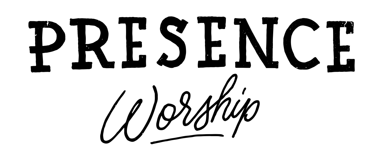
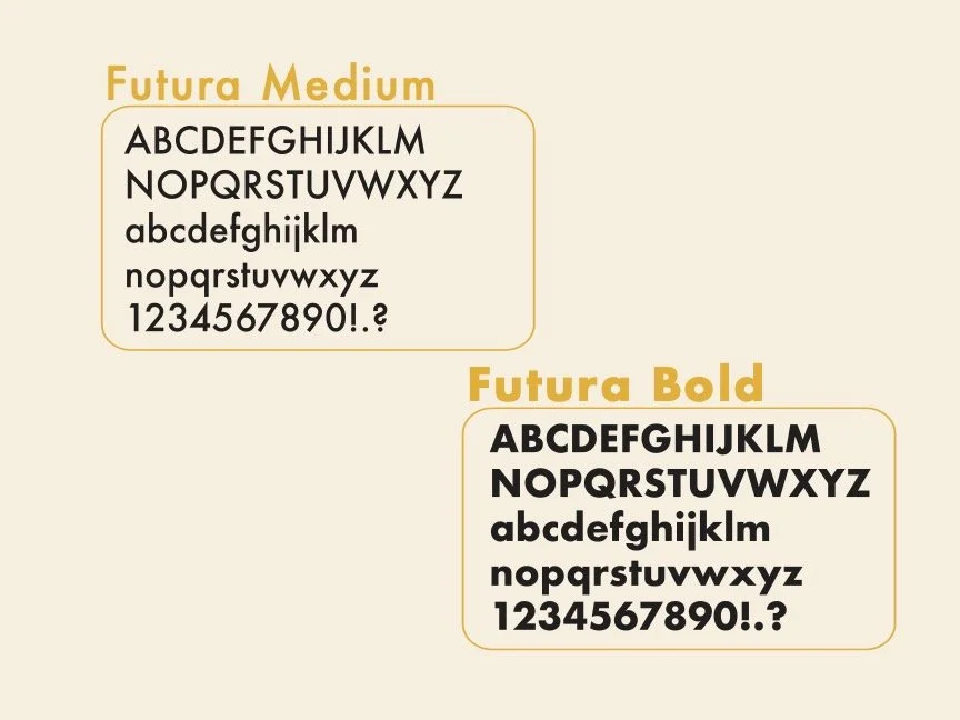
In terms of typography, I chose Futura because it is sleek, simple, and clear. I felt this type really conveys information well, letting design speak for itself.


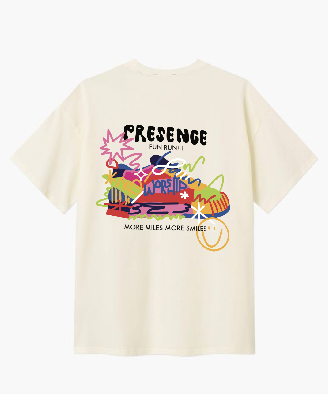
Fun Run Tee
Presence Worship does an annual 5k to raise money for their summer worship intensives! I was asked to make a fun design for a t-shirt that could be sold at the run.
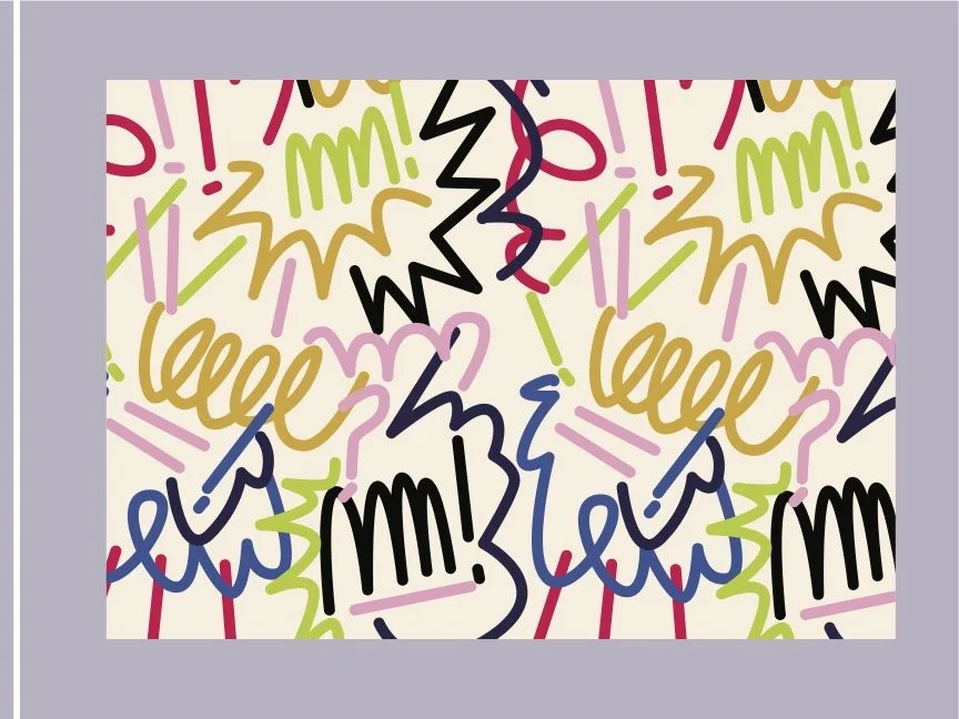
I decided to make a really fun design that incorporates all of the colors in the Presence Worship color palette, adding many of the fun and interesting design elements that especially resonate with generation Z.
As a runner, myself, I believe full-heartedly that one of the most important aspects of running is that it is an act of worship. This was something I deeply desired to come through in this design, as worship is written alongside the running shoe. In running, we have the gift of worshiping the creator of our healthy bodies and of creation we get to run through!
With this fun design, I was hoping to cater to my target audience — gen Z, while also appealing to adults who might be participating in the 5k to support presence. As a generation, we seem to be drawn towards bright colors, fun shapes, explosions of energy, and also simplicity overall.

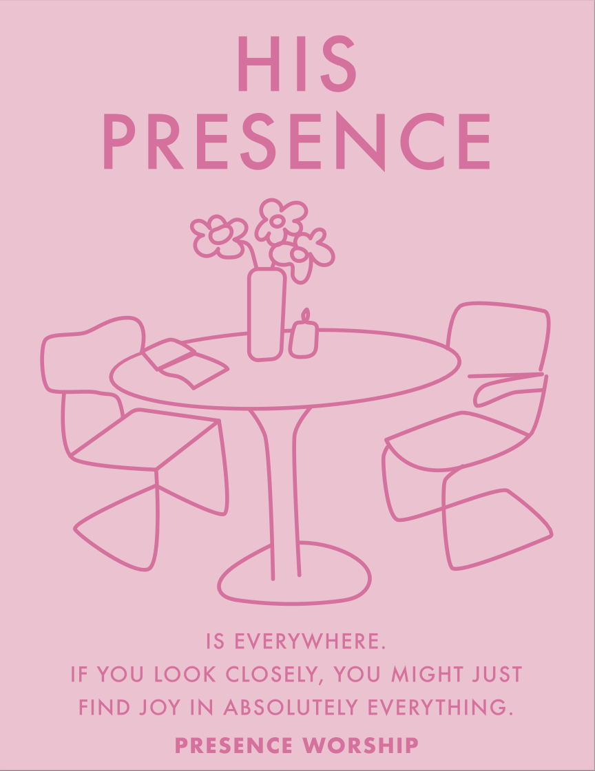
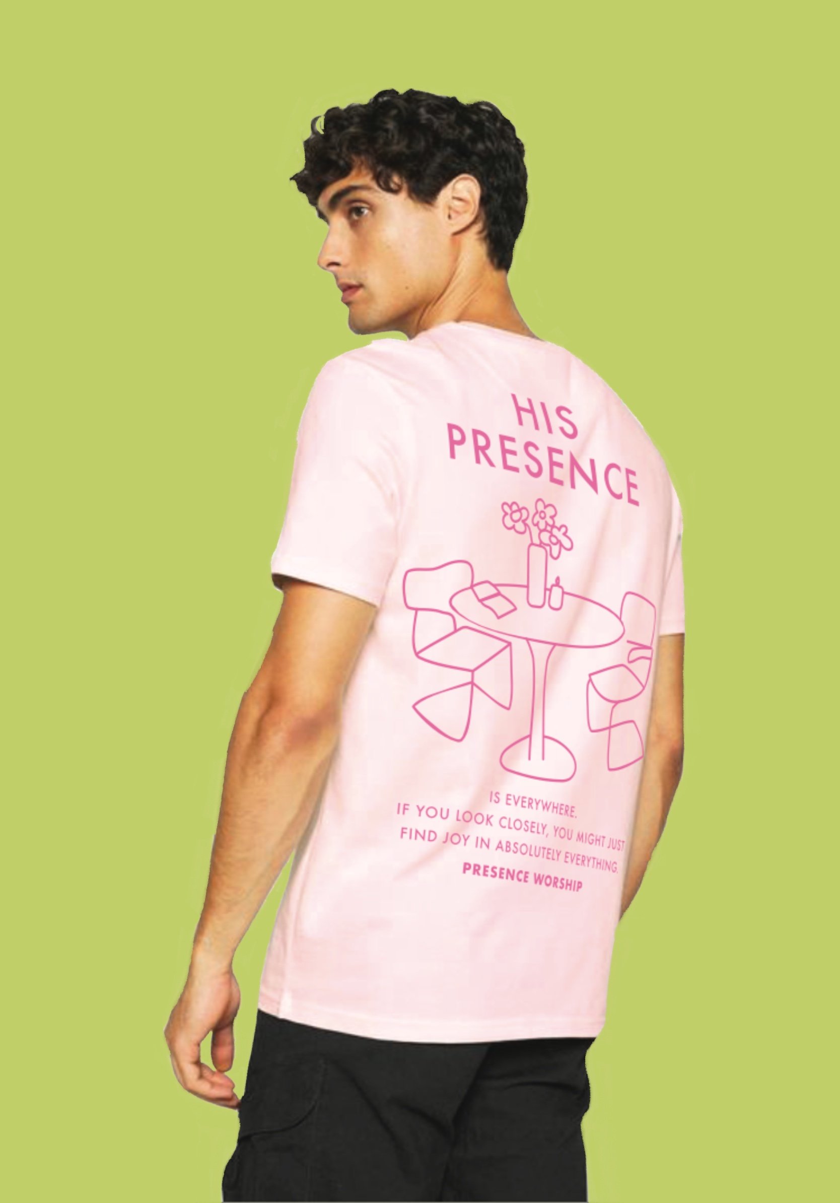
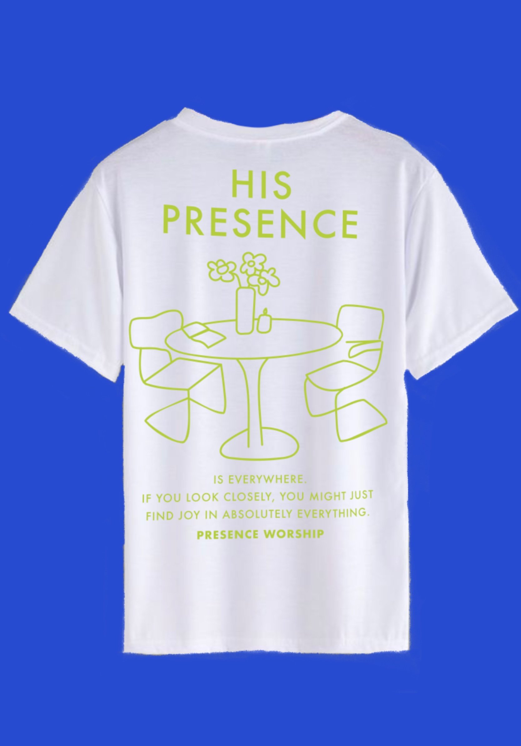
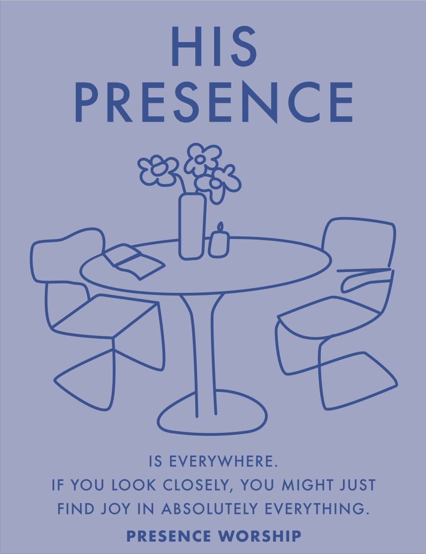
His Presence Tee
One of my favorite pieces of this project was this tee. A monochromatic solution in three color ways that cooperate with the new color palette, this t-shirt caters to the young audience with a playful illustration and meaningful text, which is currently trending in the t-shirt industry for the current youth.
This design was specifically made for the back of the t-shirt in order to help provoke thought, even for those with whom the wearer is not interacting. With this design, even standing in line at a coffee shop could provide another with questions or insight.
Those who are involved with Presence as a ministry should be interested to share their faith with others, and this shirt is a great way to do so. This design is a reminder that the Lord brings peace, that he is all-encompassing, and that, even alone, we can experience his sweet presence in something as simple as sitting at the kitchen table. In fact, there are two seats — one for you and one for the Holy Spirit, if you invite Him in.


Lilies Tote
Based on Matthew, 6:28, this tote bag is understated, yet fun. Like the “His Presence” tee, this tote can also be a conversation starter. If one does not know the origins of the phrase, “Consider the lilies,” this could open up a conversation for those wearing this tote with others.
Jesus calls us not to be anxious about our lives, what we will eat, or what we will wear because he is the ultimate provider. In this passage in particular, he reminds us of his great provision by pointing our eyes towards the dainty flowers of the field, saying,
“And why are you anxious about clothing? Consider the lilies of the field, how they grow: they neither toil nor spin, yet I tell you, even Solomon in all of his glory was not arrayed like these.”
This simple design is a reminder that we have nothing to worry about when we see creation thriving. God loves us so much more than created things and is constantly taking care of us. How sweet is that truth!


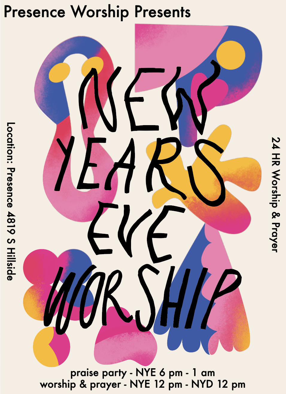
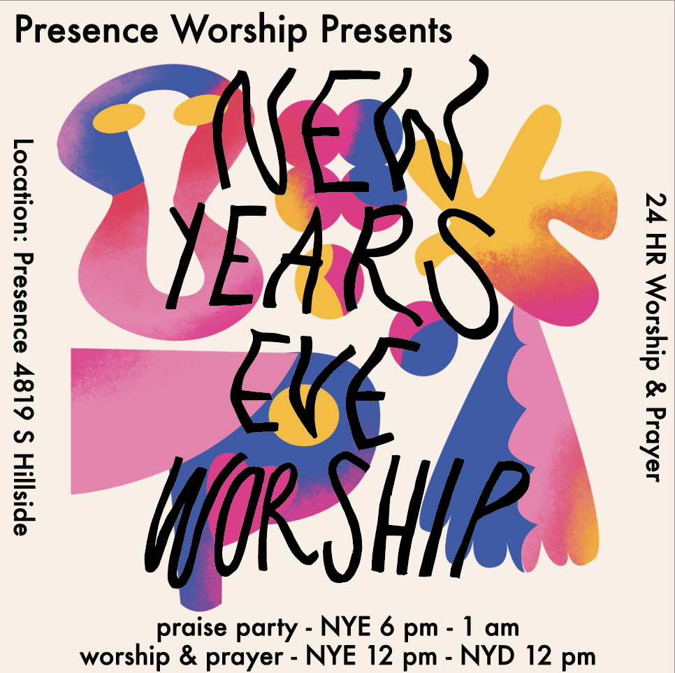
New Years Eve Poster
Presence Worship hosted a 24-hour worship and prayer event during New Years Eve from 2023-2024, inviting members all over the community of Wichita to come participate.
I was commissioned to design a poster to this event that felt youthful, inviting, and exciting. After showing a few ideas of what I thought might work, we landed on this abstract electric design.
Using the colors in the color palette and blending them together with a stippling affect, I really enjoyed working on this project. We ended up making three separate sizes — one for print, one for instagram, and one for facebook.
In the end, the event was a success, and the Lord was praised!